
Strong Tower at Washington Park
IDENTITY SYSTEM AND BRAND DEVELOPMENT
IDENTITY SYSTEM AND BRAND DEVELOPMENT
|
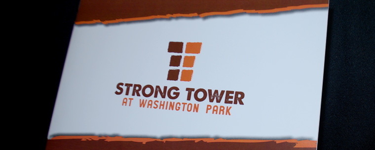
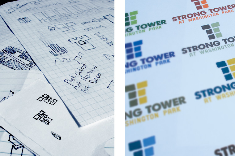
Strong Tower needed an identity that could speak to the rough and rugged community that surrounded it. A simple and authentic mark that would quickly become a recognizable image representing strength, comfort and a refuge from the daily struggle. The final product was a structured mark, which included several meanings built within the negative space. Supporting textures and colors worked together to enhance the urban-authenticity of the identity.
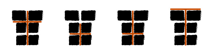
Logo Meanings
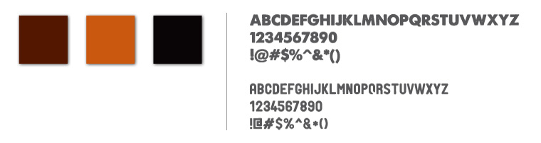
Color Palette & Typefaces
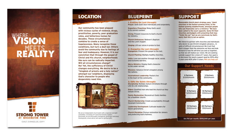
Vision Brochure
Initial Sketches and Color Exploration
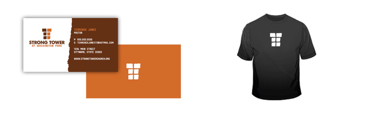
Application Ideation
Select pages from the Identity Overview brochure

|