I love info graphics like this. I also love the simple delivery of the information. Hope this helps in you social media endeavors. (The file is available for down at the link below the picture)
| Social Media Chart |

I love info graphics like this. I also love the simple delivery of the information. Hope this helps in you social media endeavors. (The file is available for down at the link below the picture)
0 Comments
We have an awesome partnership with Village Church in Buffalo and wanted to share what's They having their first gathering on October 9 and they will be hitting the ground running. 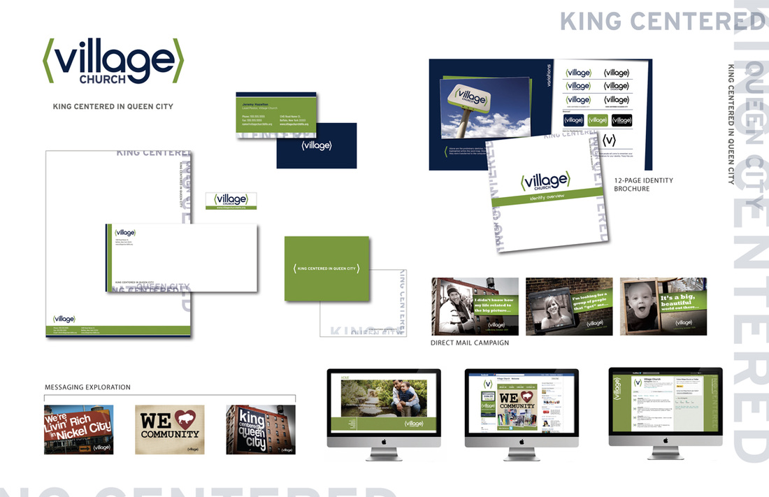 The idea of a Brand Bat is genius. Just might be something sent along to clients after completed branding projects. Thanks Ambert! On my way to church yesterday I saw a sign in the median for another church. It was a simple sandwich board with the logo, service times and location. My initial thought was "I wonder how many people will check out that church just based on that informational sign?" My second thought was "They are giving that logo a lot of responsibility." The focus of this post is based on my first thought rather than my second, but just a side-bar on my second thought:
This is exactly why a well thought-out logo is so important, sometimes it will be the only thing that conveys your church's personality. However, it's good to keep in mind that rarely will people explore your church, or even more rarely, come to Christ just on a logo alone. But it is a very important aspect of your brand. So back to my first thought... I understand that the sign builds awareness and is there for when people decide they want to find a church. But this doesn't mean it can't have some personality, especially when there are 3 other churches in the area doing the same thing, sometimes right next to the other. Anyway, here would be some of my ideas for injecting some personality: 1) Add People: Since churches will most likely have several signs placed around the community, add a different image of people on each sign. Specifically images of people that portray the type of community you are (college students, young adults, young families, different ethnicities, etc.) More than likely drivers will pass a couple of your signs, so they'll see what type of church environment you have (hopefully it's one that they relate to). 2) Add Phrases: What if, instead of leading with basic information have in large font "Hi, Que Pasa, Howdy, Look at me, I'm a sign in the median..." These simple phrases go a long way in giving your church a personality and will resonate more than just a logo and service times. 3) Be WAY different: Venture beyond a sandwich board. Put a box or arrows around a telephone pole, make a custom sign/shape or use objects that relate to your church's name or image—if your church name has something to do with water, use some old canoes or paddles to hold your signs. Yes, these ideas range in cost and effort, but I always say "I'd rather have 3 signs that get the community talking rather than 16 that they don't say anything about." | ArchivesJune 2012 CategoriesAll | ||
 RSS Feed