
This is the recently completed Style Guide/Identity Overview for Village Church. We professionally print a hard-copy of this overview for our clients.
No, you don't have to tell me, because I know what you're about to say: your new church or ministry is brilliant. It's a game-changer. Problem is, you need a killer logo. Well, today, designers, inventors, and investors are facing a dilemma similar to the one that writers and artists have struggled with for decades: there's nothing left. Or here's another problem: if you do manage to create a jaw-droppingly clever or memorable image, rather than engendering widespread consumer recall of your brand, your Easter-blue palette risks looking uneasily similar to the Tiffany box, and your little black bull is a transparent rip-off of the one that dangles from the neck of Sangre de Toro red wine.
As far as the logo is concerned, to paraphrase Bill Maher, it's time for New Rules. Today, what counts far more than a puma, a monkey, or a snarling aardvark is the cross-sensory experience your brand offers. I'm talking not only the emotion, beliefs, and desires your brand evokes, but its feel, touch, sound, smell and personality, of which the logo is just one small part. Your brand needs to be smashable, e.g., instantly identifiable via its shape, design, copy, contours, and even navigation. Aside from adolescents, who are always on the lookout for the coolest logos to set them apart from, or help them gain traction with, their peers, today for most "consumers" the logo comes in near-to-last place to other considerations. Why? Well, various reasons. The first is, when we see a logo, our defenses go up and stay up. We fear we're being played, or manipulated. Not least, I might also add that subconsciously, a logo reminds us of our complicity with big brands, of our own shot-with-guilt overconsumption that helped drive the world's recent financial downfall. The term "smashable" dates back to 1915, when the Coca-Cola company asked a designer in Terre Haute, Indiana, to design a bottle that consumers could still recognize as a Coke bottle, even if someone flung it against a brick wall and it shattered into a hundred pieces. Coke is a smashable brand. So are Guinness, Ferrari, Harley-Davidson and, of course, Apple (take a sledgehammer to an iPad and you'll know what I mean). Which suggests that the logo as we once knew and loved it--from Citibank's Scowling Umbrella (I don't know what else to call it), to Nike's Swoosh, to Starbucks's Whoever-The-Heck-She-Is--needs to be re-considered if it's going to play any role in future brand-building. Let's do a little experiment: Erase the logo from every single one of your brand identifiers--collateral, stationary, signage. Close your eyes, now reopen them. Is there anything left? Would consumers still recognize those items as belonging to your brand? Look at your packaging, your copy, your colors, your design, your font, your spacing. Do any of them convey your brand's identity? Or without a logo are you adrift and bailing water? Next let's examine your website. Again, by eliminating the logo, you'll embark on a fun (I promise) and instructive exercise that will relieve you of any stubborn logo-fixations that may still be nagging at you. It's one that will force you into acknowledging the value that every single one of your communication elements plays in defining your brand's identity. Okay, still hiding the brand logo, eyeball your copy, your graphics, whether your pages are spare or dense-looking. Do all these things convey what your brand represents? Does your brand have a personality anymore, or is it standing shyly and stiffly against the wall, hoping no one notices it now looks (I hate to tell you) like every other church brand out there? So reserve a brick wall, cock your arm, aim, and begin smashing your brand. While you're at it, smash your website, to ensure your brand remains consistent via your web pages' navigation, style, ease, and/or special features. Now ask yourself: does my brand "own" this cross-sensory experience, from web to signage to marketing collateral. If not, your carefully crafted logo might as well not even exist. From Fast Company. Author: Martin Lindstrom. Modified to relate to church and ministry branding. Author: Chris Johnson All to often we lean toward safe, bland, me-too branding. This is understandable, but it is also not a good idea, that is if we want to be even moderately effective. Churches can easily find themselves safe... and invisible... to just those people you really want to reach. To become viral or talked about... to be remarked about... you have to become remarkable! Create a brand identity that... 1) ...is arresting, surprising, one that will get talked about. 2) ...unique among contending appeals 3) ...has strong appeal to unchurched and dechurched people in the area 3) ...you can adopt and live out in a remarkable way. 4) ...provides a long term, strategic fit in your city reaching goals 5) ...provides many creative, adaptive, thematic spinoffs Grab our Identity Brochure PDF that explores how an identity is developed and used within the larger "brand picture." Don't worry, this isn't a sales piece, just an identity overview that gives a little insight into how we think here at Brand Army. 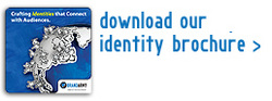 The questions below are examples of the kinds of things you can ask your staff, members and friends, in order to get an idea of what they really think of your church or ministry brand and if that impression is the one you want to continue to foster, or if you need to go back to the drawing board and create new experiences and better advertising that generates a more positive emotional aftertaste and a more effective brand image.
You can add or make-up your own questions based on the following format: "If your brand were a 'concept here', what 'concept' would it be? Explain why?" If the word brand stumps your colleagues that's a sure sign you have a problem, so try substituting the phrase "church, ministry, or service" for brand. Make sure the concepts you use are as removed from your normal frame of reference as possible and try to find ones that tap into some kind of emotional aftertaste and see what results you get. You will most likely be very surprised, bemused, and enlightened by the results. The Emotional Brand Aftertaste Questionnaire
| ArchivesJune 2012 CategoriesAll |
 RSS Feed